LINES
fig 26
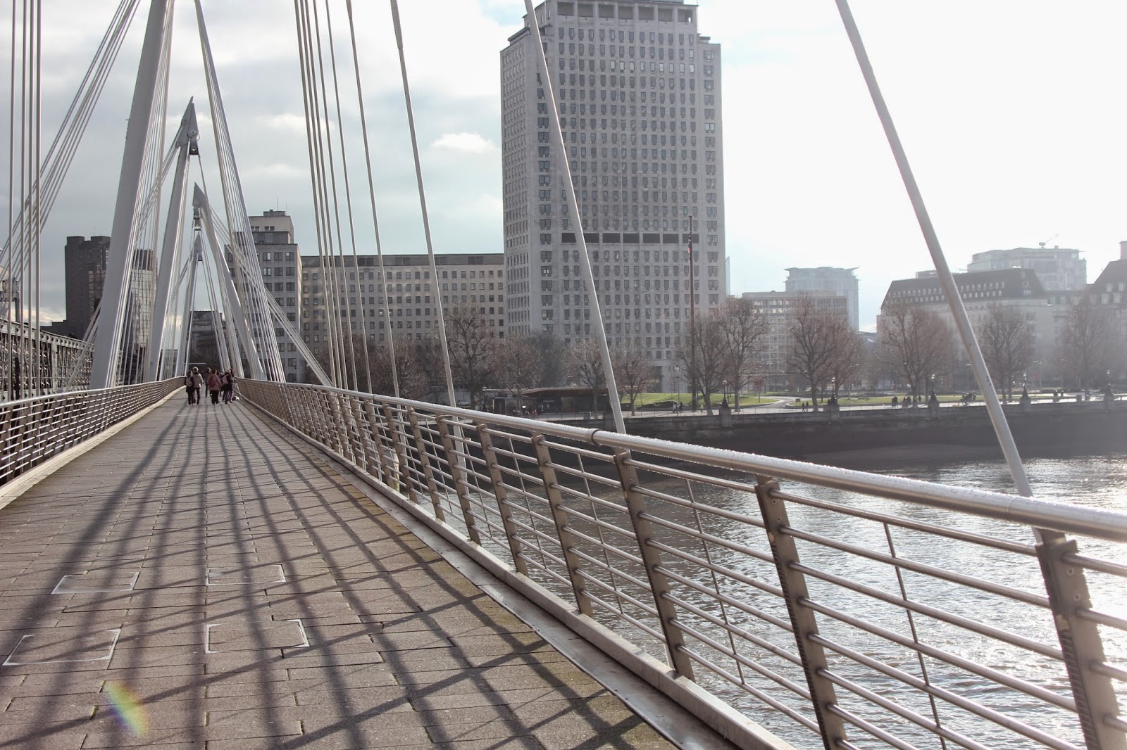
Picture taken on the Hungerford bridge
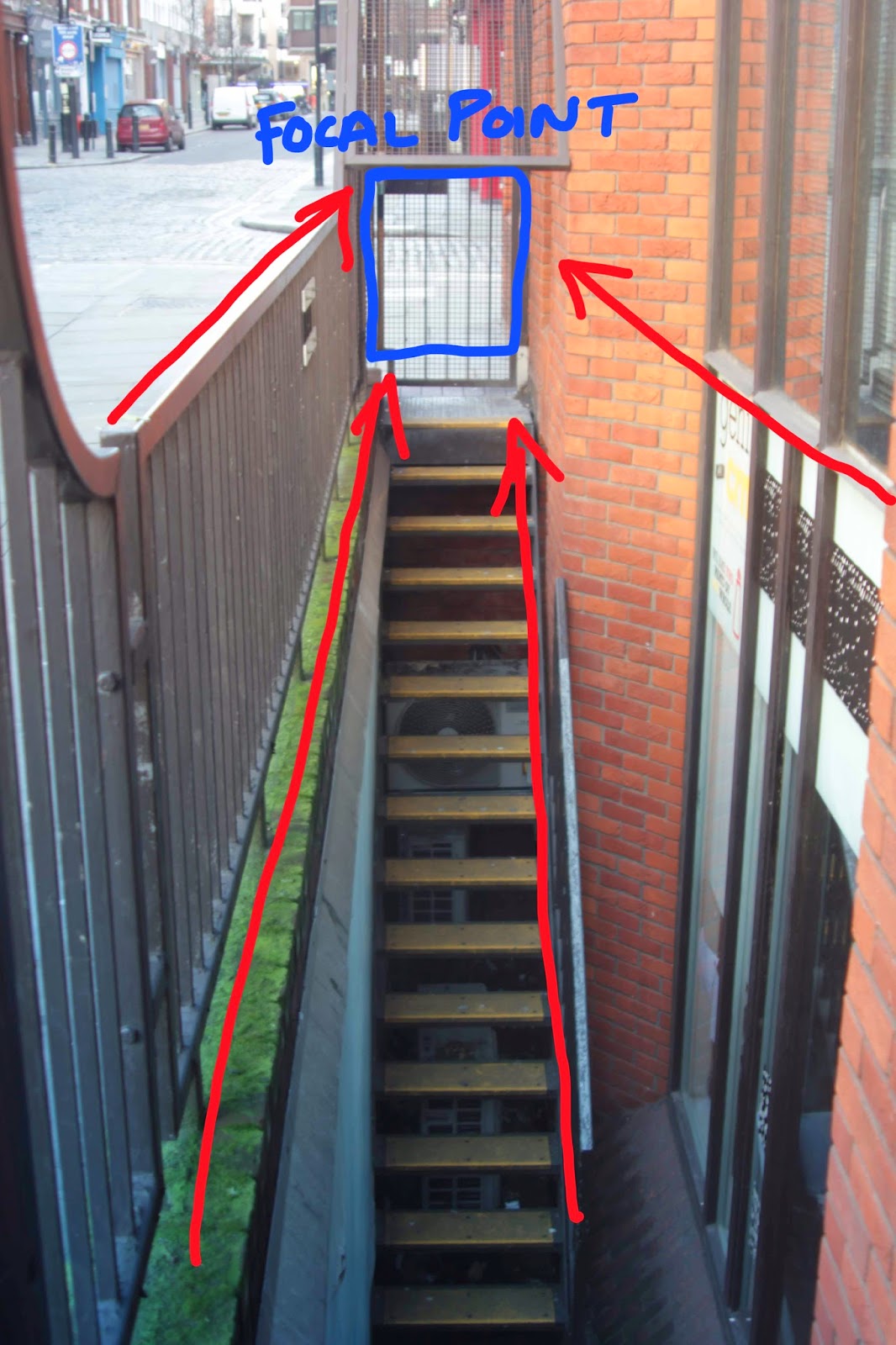
In this picture I find that the lines from the staircase draw the viewers eyes to both subjects whilst the thick line from the map suggests a barrier between them. I also like the way the natural, slender curves from the background trees contrast with the straight lines from the buildings behind.
in this image, I used lines to construe a meaning in the picture, a depiction of the separation between the more and less privileged in London.
On the left, we see a woman positioned higher than the other subject. She is holding what is clearly a powerful, expensive camera. The lines formed by the staircase quickly draw the viewers attention to the man on the bottom right. He is holding a much smaller, evidently less expensive camera.
The body language of the man however, suggests that of a more experienced photographer whereas the woman looks more like a tourist. The lineage on the man's legs looks stronger and straighter, confirming him as a more professional photographer, the woman's legs are bent in a way which suggests less experience. The signs in the middle provides a visual representation of this divide.
fig 27
28
fig 29
As this project has progressed, I have become more aware as a photographer of using existing lines in the image to draw focus to a specific point or subject in the picture, helping me create more emotive, interesting pictures.
fig 30
fig 31
FORM
Form grants objects their three dimensional shape in an image. It can be created and manipulated by the photographers using light, and shadows to give specific depths to the subject(s).
fig 32
fig 32.5
fig 33
The thing that I love about this picture is the fact that its obviously three dimensional shape is given almost exclusively by the shadows and the angles of the bricks within.
PATTERN
Patterns are formed by a repeated image or idea within a photograph. Natural or unnatural, they can lend a sense of form to to the picture, creating an overall mood. Some patterns (particularly if symmetrical) can create balance in the photographs whilst others can be used to focus the attention of the viewer at a specific point of interest (e.g. the point at which the pattern is broken or uneven)
fig 34
(above) an example of a complex, relatively natural pattern, (below) some different brick patterns. All taken from Harrow on the Hill.
(above) an example of a complex, relatively natural pattern, (below) some different brick patterns. All taken from Harrow on the Hill.
The pattern is broken with use of the three dark bricks
fig 35
Above is an abstract pattern, reminiscent of a graveyard. the juxtaposition of the skateboards, commonly associated with youth and fun, with their rotting, broken form give the image a sense of lost childhood and general sadness.
fig 36

fig 37
felt the need to include at least one abstract pattern, so I managed to find this fantastic place (which has since been cleared up).
RULE OF THIRDS
The rule of thirds (ROT) is an artistic term for the "power points" on an image where the main subject(s) should be, the areas where the human eye naturally travels during a viewing. These can be shown on a grid (seen below) by dividing the shot into 9 roughly equal rectangles. The subject should fall on any of the 4 corners of the central square.
fig 38
Below is my first attempt at exploration of the rule of thirds. Taken on the first of February 2014, in an antique pottery shop on Cambridge Circus.
I was fortunate to have a subject who was willing to stay in the same position as I walked forwards, taking low angle ROT photos. I tried to keep her head in roughly the same position in each photo.
fig 39
fig 40
fig 41
fig 42
This was another example of my playing with the rule of thirds with the position of the bicycle handles. The lines from the road both draw attention to the bike and make the traffic lights and buildings in the background seem further away - an interesting illusion of sorts.
fig 43
fig 44
In this picture, the lines add some focus in to the man, but mainly I find that they encourage the viewers eyes towards the black telephone box in the background. This, coupled with the man's uncomfortable expression, could suggest that the man has just come from there - a possible example of storytelling.
fig 45
The pattern of lines in the background (a fence) seem to imitate those of a cage - this photo could imply that she is free, or has recently left a cage of sorts - an idea which is underlined by her pleased expression. I also tried to obey ROT here.
fig 46
Again, the lines from the road seem to add extra distance between the main subject near the lens and the cars - perhaps implying that he feels far away from his apparent job as a traffic warden somehow, or perhaps that he is on his way to the cars.
fig 47
In this picture I was really trying to capture a range of man-made lines and patterns - from the ground to the windows of the buildings. I love the way the lines from the road leads into the heart of the picture whilst the sign/water fountain near the lens act as almost human spectators.
fig 48
Although I do like the pattens in the ground and the buildings of stone, the main thing I focussed on in this picture was the way that the sides of the buildings provide extra framing.
fig 49
Taken with the fish-eye lens on the Hungerford bridge. This is one of my favourite pictures as it really show the distortion powers of the lens. The way that it lengthens all lines near the centre makes the bridge appear miles long and incredibly surreal. The blue sky really helps as well. The only thing that annoys me about this picture is the fact that the corners of the lens cover can be seen in the top corners.
50
51
fig 52
Composition storytelling, the picture below tells a story of old and new London, with the modern and retro style of the London red bus.
fig 53
Evaluation
What Went Well:
I have learned:
- Lines and patterns can be incredibly useful when constructing a narrative in a picture.
- Composition techniques (eg use of the rule of thirds, the Fibonacci ratio) to draw the viewer's focus to specific places within the picture. This was realised later on in the project.
Improvements
In hindsight, looking over the pictures I have taken, there are some things that I feel could have been better, for example:
- I would have liked to have explored the relevance of other geometric principles like the use of Pascal's triangle or pi


No comments:
Post a Comment