Text in Image
As this part of the project was meant to be focussed on text and image, I had originally decided to do a photoshoot inside a tattoo parlour, however copyright of the tattoos themselves became an issue - the staff explained to me that buying books with designs costs a lot of money.
Perhaps one of the main reasons why I was so interested in body art was the fact that my mother studied photography as part of her journalism degree, and produced a full photoshoot taken from inside a tattoo parlour, and I loved the final pictures there. This shoot was taken almost 20 years ago, and apparently since that time, people have become less open to share their designs for fear of copyright being breached through social media.
I attempted to hire a tattooed woman as a model but she was unavailable at the time. In the end I decided to hire a professional life model and project words and images on her back. In hindsight I am actually quite happy that this is what happened, as this meant that I could choose the images on her skin, and I had more flexibility within the shoot. I took roughly 400 pictures over a 3 hour shoot, and below are the results. This experience taught me the value of having a professional model as she was incredibly patient and willing to stay in exactly the same position over long periods, allowing me to experiment with various camera settings and lighting arrangements for the best possible shot. I also really liked her colouring - she had red hair and very pale blue eyes and pale skin. I met the model a week before, which allowed me to plan the shoot carefully and draft some images.
a) Skateboarders and Graffiti
Below are a collectrion of pictures taken at the South Bank skate park. In this page I want to explore art in its more unconventional forms.
fig 261
The main thing that caught my eye in this area was the colours which had been added by the youths. I feel that the are may have lost a lot of its magic without the graffiti - not common for vandalism. Perhaps the reason why it worked so well was because the graffiti was controlled, and it was understood among the boys that it had to look good, not just express views.
fig 262
fig 265
fig 268
B) TEXT WITH FRIENDS
fig 269
fig 270
fig 271
fig 272
fig 273
fig 274
fig 275
C) PROFESSIONAL MODEL (TEXT PROJECTED ON SKIN
fig 276
Photograph by William DeMichele, 1998
A very famous tattoo photographer from which I took inspiration was William DeMichele. He often photographs his subjects in colour against a black background, adding emphasis to the colours and give the picture a surreal feel. DeMichele is known for taking pictures which strongly resemble paintings, such as a Rembrant.
fig 277
picture by Jessie Hemdon
fig 278
picture by Jessie Hemdon
Fig 277 and 278 are just 2 of a huge range of images from which I drew inspiration to do this projection shoot. The main photographer I looked at here was Jessie Hemdon, and in the project I tried to imitate her style and mood.
fig 279
fig 280
fig 281
The image I spent the most time projecting onto her back in various positions was an old philosophy essay which I had done prior to this project. I wanted this whole photoshoot to have very strong links with the idea of nature and Adam and Eve, so I felt that an essay exploring the subject of their expulsion from Eden was quite effective.
fig 282
fig 283
fig 284
fig 285
fig 286
D) STORE SIGNS AND BILLBOARDS
fig 287
fig 288
fig 289
fig 290
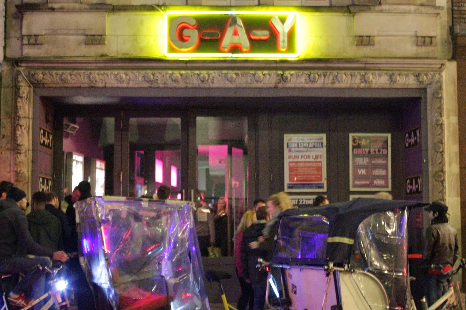
I saw figure 289 at the Tate Modern, and felt inspired to create a modern day version, demonstrating the progression in the tolerance level of modern society - being gay in 1966, a Burlesk show would have been quite vulgar, but now it is possible for LGBT society to be a lot more open.
fig 291
Evaluation
What Went Well:
Overall, I am very pleased with the photographs I have taken, I have learned:
- How to effectively use words or small images inside a picture to add meaning
- The effect of colourful text on the impact it has on the viewer (see fig 191 to 198)
Improvements
In hindsight, looking over the pictures I have taken, there are some things that I feel could have been better, for example:
- I did not use as many billboards or street signs as I had planned
- I had hoped to do a small project here in the style of Gillian Wearing, but did not have time


No comments:
Post a Comment